3D, Part 2: How 3D Peaked At Its Valley
By Yasmina Tawil
I didn’t expect to spend Thanksgiving Weekend 2018 watching ten 3D movies: marathon viewing is not my favorite experience in general, and I haven’t spent years longing to see, say, Friday the 13th Part III, in 35mm. But a friend was visiting, from Toronto, to take advantage of this opportunity, an impressive level of dedication that seemed like something to emulate, and it’s not like I had anything better to do, so I tagged along. Said friend, Blake Williams, is an experimental filmmaker and 3D expert, a subject to which he’s devoted years of graduate research and the bulk of his movies (see Prototype if it comes to a city near you!); if I was going to choose the arbitrary age of 32 to finally take 3D seriously, I couldn’t have a better Virgil to explain what I was seeing on a technical level. My thanks to him (for getting me out there) and to the Quad Cinema for being my holiday weekend host; it was probably the best possible use of my time.
The 10-movie slate was an abridged encore presentation of this 19-film program, which I now feel like a dink for missing. What’s interesting in both is the curatorial emphasis on films from 3D’s second, theoretically most disreputable wave—‘80s movies with little to zero critical respect or profile. Noel Murray considered a good chunk of these on this site a few years ago, watching the films flat at home, noting that when viewed this way, “the plane-breaking seems all the more superfluous. (It’s also easy to spot when these moments are about to happen, because the overall image gets murkier and blurrier.)” This presumes that if you can perceive the moments where a 3D film expands its depth of field for a comin’-at-ya moment and mentally reconstruct what that would look like, that’s basically the same experience as actually seeing these effects.
Blake’s argument, which I wrestled with all weekend, is that these movies do indeed often look terrible in 2D, but 3D literally makes them better. As it turns out, this is true surprisingly often. Granted, all concerned have to know what they’re doing, otherwise the results will still be indifferent: it turns out that Friday the 13th Part III sucks no matter how you watch it, and 3D’s not a complete cure-all. This was also demonstrated by my first movie, 1995’s barely released Run For Cover, the kind of grade-Z library filler you’d expect to see sometime around 2 am on a syndicated channel. This is, ostensibly, a thriller, in which a TV news cameraman foils a terrorist plot against NYC. It features a lot of talking, scenes of Bondian villains eating Chinese takeout while plotting and/or torturing our ostensible hero, some running (non-Tom Cruise speed levels), and one The Room-caliber sex scene. Anyone who’s spent too much time mindlessly staring at the least promising option on TV has seen many movies like these. The 3D helps a little: an underdressed TV station set takes on heightened diorama qualities, making it interesting to contemplate as an inadvertent installation—the archetypal TV command room, with the bare minimum necessary signifiers in place and zero detail otherwise—rather than simply a bare-bones set. But often the camera is placed nowhere in particular, and the resulting images are negligible; in the absence of dramatic conviction or technical skill, what’s left is never close enough to camp to come back out the other side as inadvertently worthwhile. I’m glad I saw it for the sheer novelty of cameos from Ed Koch, Al Sharpton and Guardian Angels founder Curtis Sliwa—all doing their usual talking points, but in 3D! But it’s the kind of film that’s more fun to tell people about than actually watch.
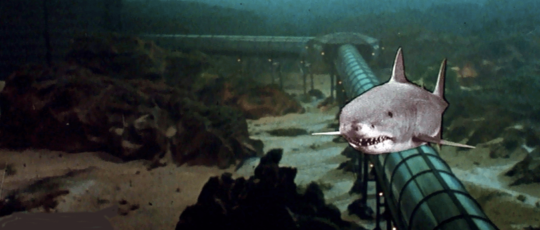
But infamous punchlines Jaws 3-D and Amityville 3-D have their virtues when viewed in 3D. The former, especially, seems to be the default punching bag whenever someone wants to make the case that 3D has, and always will be, nothing but a limited gimmick upselling worthless movies. It was poorly reviewed when it came out, but the public dug it enough to make it, domestically, the 15th highest-grossing film of 1983 (between Never Say Never Again and Scarface) and justify Jaws: The Revenge. Of course I was skeptical; why wouldn’t I be? But I was sucked in by the opening credits, in which the familiar handheld-underwater-cam-as-shark POV gave way to a severed arm floating before a green “ocean.” Maybe flat it looks simply ludicrous, but the image has a compellingly Lynchian quality, as if the limb were detached from one of Twin Peaks: The Return’s more disgusting corpses, its artifice heightened and literally foregrounded, the equally artificial background setting it into greater relief.
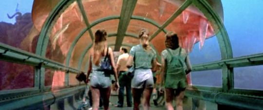
The film’s prominent SeaWorld product placement is, theoretically, ill-advised, especially in the post-Blackfish era; in practice, it’s extremely productive. The opening stretches have a lot of water-skiing; in deep 3D, the water-skiers serve as lines tracing depth towards and away from the camera over a body of water whose horizon line stretches back infinitely, producing a greater awareness of space. It reminded me of the early days of the short-lived super-widescreen format Cinerama, as described by John Belton in his academic history book Widescreen Cinema (recommended). The very first film in the format, This is Cinerama, was a travelogue whose stops included Cypress Gardens, Florida’s first commercial tourist theme park (the site is now a Legoland), which has very similar images of waterskiiers. Cinerama was, per the publicist copy Belton quotes from the period, about an experience, not a story: “Plot is replaced by audience envelopment […] the medium forces you to concentrate on something bigger than people, for it has a range of vision and sound that no other medium offers.” Cinerama promised to immerse viewers, as literalized in this delightful publicity image; Belton argues that “unlike 3-D and CinemaScope, which stressed the dramatic content of their story material and the radical new means of technology employed in production, Cinerama used a saturation advertising campaign in the newspapers and on radio to promote the ‘excitement aspects’ of the new medium.” There’s a connection here with the earliest days of silent cinema, short snippets (“actualities”) of reality, before it was decided that medium’s primary purpose was to tell a story. It didn’t have to be like that; in those opening stretches, Jaws 3-D’s lackadaisical narrative, which might play inertly on TV, recalls the 1890s, when shots of bodies of water were popular subjects. This is something I learned from a recent presentation by silent film scholar Bryony Dixon, and her reasoning makes sense. The way water moves is inherently hypnotic, and for early audiences assimilating their very first moving images, water imagery was a favorite subject. It’s only with a few years under its belt that film started making its drift towards narrative as default; inadvertently or not, Jaws 3-D is very pure in its initial presentation of water as a spectacular, non-narrative event.
If this seems like a lot of cultural and historical weight to bring to bear upon Jaws 3-D, note that it wasn’t even my favorite of the more-scorned offerings I saw that weekend, merely one that makes it easiest for me to articulate what I found compelling about the 3D immersion experience. I haven’t described the plot of Jaws 3-D at all, which is indeed perfunctory (though it was nice to learn where Deep Blue Sea cribbed a bunch of its production design from). I won’t try to rehabilitate Amityville 3-D at similar length: set aside the moronic ending and Tony Roberts’ leading turn as one of cinema’s most annoyingly waspish, unearnedly whiny divorcees, and what’s left is a surprisingly melancholy movie about the frustrations, and constant necessary repairs, of home ownership. There’s very little music and a surprising amount of silence. The most effective moment is simply Roberts going upstairs to the bathroom, where steam is hissing out for no apparent reason and he has to fix the plumbing. The camera’s planted in the hallway, not moving for any kind of emphasis as the back wall moves closer to Roberts; it doesn’t kill him and nothing comes of it, it’s just another problem to deal with (the walls, as it were, are settling), made more effective by awareness of how a space whose rules and boundaries seemed fixed is being altered, pushing air at you.

Watching a bunch of these in sequence, some clear lessons emerge: if you want to generate compelling depth by default, find an alleyway and block off the other half of the frame with a wall to present two different depths, or force protagonists to crawl through ducts or tubes. This is a good chunk of Silent Madness, a reasonably effective slasher film that, within the confines of its cheap sets and functional plotting, keeps the eye moving. It’s an unlikely candidate for a deep-dive New York Times Magazine article from the time period, which is well worth reading in full. It’s mostly about B-movies and the actresses trying to make their way up through them, though it does have this money quote from director Simon Nuchtern about why, for Bs, it’s not worth paying more for a good lead actress: “If I had 10,000 extra dollars, I’d put it into lights. Not one person is going to say, ‘Go see that movie because Lynn Redgrave is in it.’ But if we don’t have enough lights and that 3-D doesn’t pop right out at you, people are going to say, ‘Don’t see that movie because the 3-D stinks.’” Meanwhile, nobody appears to have been thinking that hard while making Friday the 13th: Part III, which contains precisely one striking image: a pan, street morning, as future teen lambs-to-the-slaughter exit their van and walk over to a friend’s house. A lens flare hits frame left, making what’s behind it briefly impossible to see: this portion of the frame is now sealed off under impermeable 2D, in contrast to the rest of the frame’s now far-more-tangible depth. The remainder of the movie makes it easy to imagine watching it on TV and clocking every obvious, poorly framed and blocked 3D effect, from spears being thrown at the camera to the inevitable yo-yo descending at the lens. (This is my least favorite 3D effect because it’s just too obvious and counterproductively makes me think of the Smothers Brothers.)
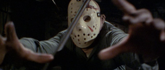
Friday the 13th was the biggest slog of the 3D weekend, and the one most clearly emulating 1981’s Comin’ at Ya! I am not going to argue for that movie, either, which is generally credited with kicking off the second 3D craze; it’s a sludgy spaghetti western that delivers exactly as its title promises, using a limited number of effects repeatedly before showing them all again in a cut-together montage at the end, lest you missed one in its first iteration. It’s exhausting and oddly joyless, but was successful enough to generate a follow-up from the same creative team. Star Tony Anthony and director Ferdinando Baldi (both veterans of second-tier spaghetti westerns) re-teamed for 1983’s Treasure of the Four Crowns, the movie which (two screenings in) rewired my brain a little and convinced me I should hang around all weekend. This is not a well-respected film, then or now: judging by IMDb user comments, most people who remember seeing it recall it playing endlessly on HBO in the ‘80s, where it did not impress them unless they were very young (and even then, perhaps not). Janet Maslin admitted to walking out on it in her review; then again, she did the same with Dawn of the Dead, and everyone loves that.
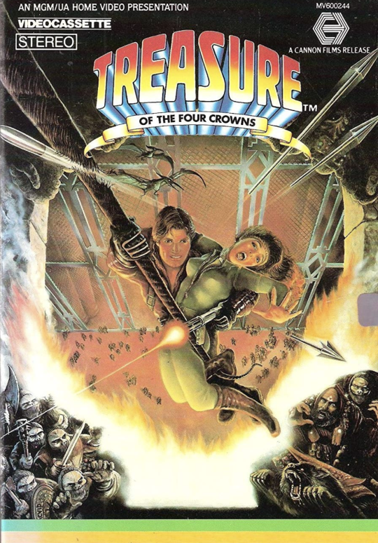
An unabashed Indiana Jones copy, Treasure begins strong with a lengthy opening sequence of tomb raider J.T. Striker (Anthony) dropping into a cave, where he’s promptly confronted not only with a bunch of traps but, for a long stretch, a small menagerie’s worth of owls, dogs, and other wildlife. There are a lot of animals, and why not? They’re fun to look at, and having them trotted out, one after another, is another link back to silent cinema; besides water, babies and animals were also popular subjects. The whole sequence ends with Striker running away from the castle above the cave, artifact retrieved, in slow-motion as Ennio Morricone’s score blares. There is, inevitably and nonsensically, a fireball that consumes the set; it unfolds luxuriously in detailed depth, the camera placed on a grassy knoll that gives us a nice angle to contemplate it looking upwards, a nearly abstract testament to the pleasures of gasoline-fueled imagery. Shortly thereafter, Striker is in some European city to sell his wares, and in every shot the camera is placed for maximum depth: in front of a small city park’s mini-waterfall, views of streets boxed in by sidewalks that narrow towards each other, each position calibrated to create a spectacular travelogue out of what’s a fairly mundane location. There’s an expository sequence where Striker and friends drop into a diner to ask about the whereabouts of another member of the crew they need to round up. Here, with the camera on one side of a bar encircling a center counter, there are something like six layers of cleanly articulated space, starting with a plant’s leaves right in front of the lens on the side, proceeding to the counter, center area, back counter, back tables and walls of the establishment. Again, the location is mundane; seeing it filleted in space so neatly is what makes it special.
The climax finally convinced me I was watching forgotten greatness. This is an elaborate heist sequence in which, of course, the floor cannot be touched, necessitating that the team perform all kinds of rappelling foolishness. At this point I thought, “the only way I could respect this movie more is if it spent 10 minutes watching them get from one side of the room to another in real time.” First, the team has to gear up, which basically means untangling a bunch of ropes—clearly not the most exciting activity. The camera is looking up, placed below a team member as they uncoil and then drop a rope towards the lens. This is a better-framed variant of the comin’-at-ya principle, but what made it exciting to me was the leisurely way it was done: no more whizzing spears, but a moment of procedural mundanity as exciting as any ostensible danger. Basic narrative film grammar is being upended here: if a rope being dropped is just as exciting as a big, fake rip-off boulder chasing our hero down the cave, then all the rules about what constitutes narrative are off—narrative and non-narrative elements have the exact same weight, and even the most mundane, A-to-B connective shot is a spectacular event.
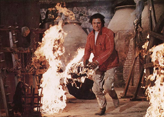
This isn’t how narrative cinema is supposed to work, and certainly not what James Cameron’s conception of good 3D proposed. The movie keeps going, building to a bizarrely grim climax involving a lot of face-melting, scored by Morricone’s oddly beatific score, which seems serenely indifferent to the grotesqueness of the images it’s accompanying. (This is a recurring trait in the composer’s ‘80s work; the score for White Dog often seems to bear no relation to the footage it’s accompanying.) That would make the movie oneiric and weirdly compelling even on a flat TV, but everything preceding convinced me: 3D can be great because it’s 3D, not because it serves a story. I’ve spent the last decade getting more angry about the format than anything, but that was a misunderstanding. Treasure of the Four Crowns is, yes, probably very unexceptional seen flat; seen in all three dimensions, it’s a demonstration of how 3D can turn banal connective tissue and routine coverage into an event. The spectacle of 3D might never have been its potential to make elaborate CG landscapes more immersive, something I still haven’t personally been convinced of; as those 19 non-CG shots in Avatar showed (undermining Cameron’s own argument!), 3D’s renderings of the real, material world and objects have yet to be fully explored. 3D’s ability to link film back to its earliest days is refreshing, in the way that any rediscovery of forgotten parts of film language can be, while also encouraging thought about all the things narrative visual language hasn’t yet explored, as if 3D could take us forwards and backwards simultaneously. In any case, I’m now won over—ten years after Avatar, but better late than never.
